Honest Approach Dating
Bringing a rather unique vision to life – a nostalgic game with a dating twist.
That awkward moment when you realize he/she wants more than a hook-up...
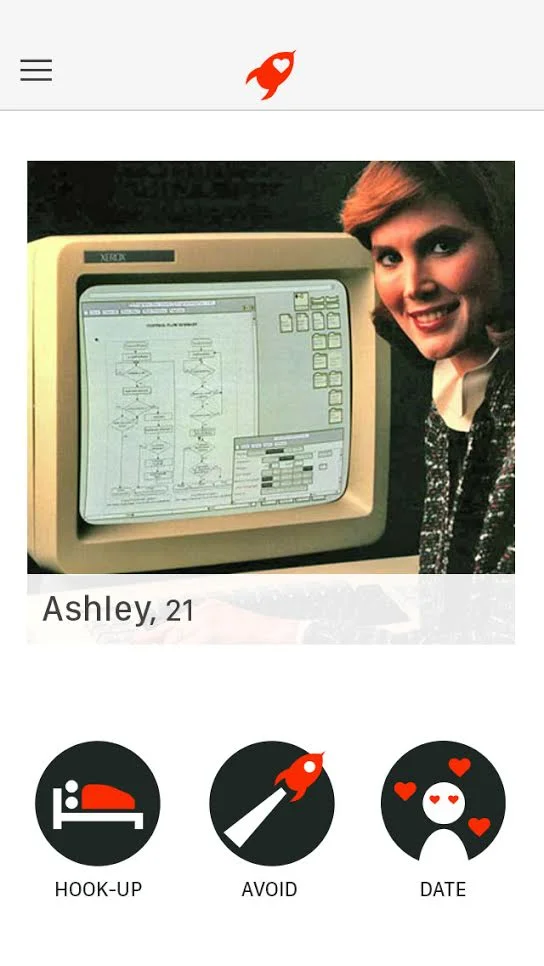
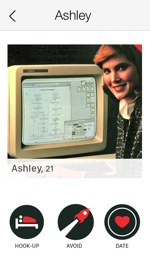
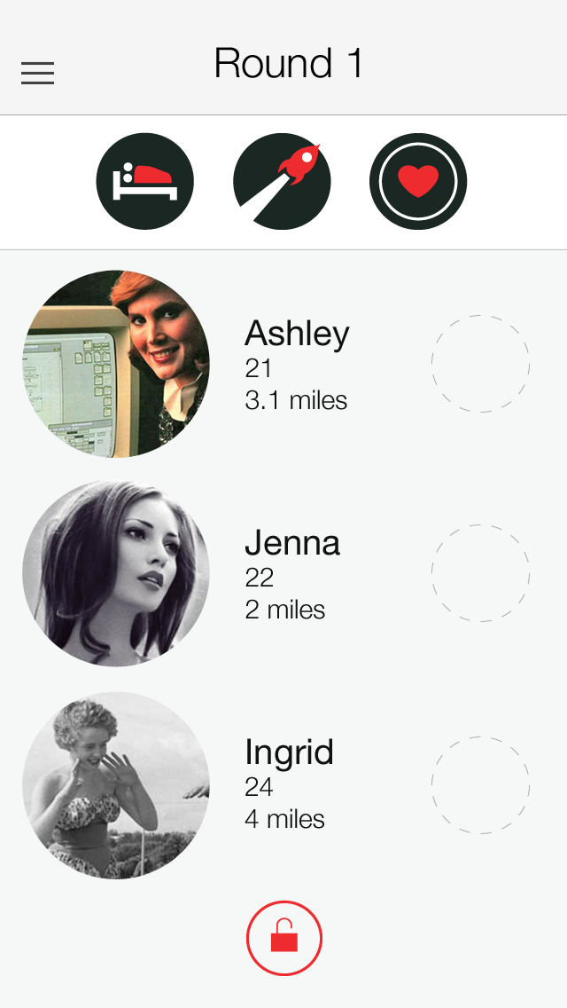
The HAD team developed a really interesting mission... make dating honest again. They jumped into the overwhelming world of online dating and set out to create an app blending honesty, dating, and a bit of a gaming flare. Remember the old time game Marry, F***, Kill where you were presented 3 people and you had to make the tough decision to decide who you wanted to do what to? (Entirely hypothetical of course). Had is a reinterpretation of this game, but with a dating twist – HookUp, Avoid, Date. Forcing users to express their intentions first made for more honest matches and better first dates. When I came on board for UI/UX support, they already had a few designs together from a previous teammate and were looking to really make their main "Game" view unique and fun to use.
PROJECT OVERVIEW
Company: Honest Approach
Dating (HAD)
Date: 2016, 2017
Role: UI/UX Designer
Disciplines: Product Strategy, UI/UX Design, Branding
The app was titled Hook Up Avoid Date when we started the project. Read on to learn why it changed...
Understanding the existing design work
Since I was brought on the project after some work had already been done on the interface, I sat down with the founding team to better understand their vision, the feature set, and what they liked or didn't like about the existing design work. While they were satisfied with most of it for their MVP, they were interested in minor tweaks and my take on a new design for their "Game" view where users make their selections.
Things that needed attention:
• Inconsistency in iconography
• Harshness of color choices
• Lack of profile detail information
• Attention to on-boarding
Additional help needed with:
• Providing detailed specs to overseas development team
The importance of the profile.
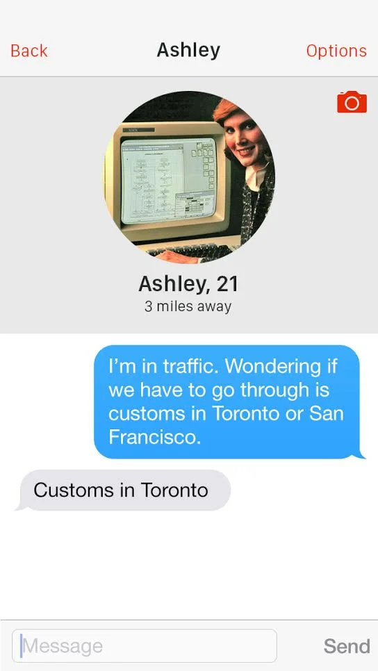
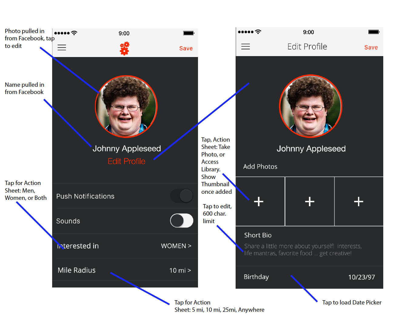
Creating a simple dating app with the fun gaming elements that Had brought to the table, meant that the user profile functionality was critical to a successful match.
Simple specs that were sent to engineering to insure that functionality would be spot on.
Little things make a big difference.
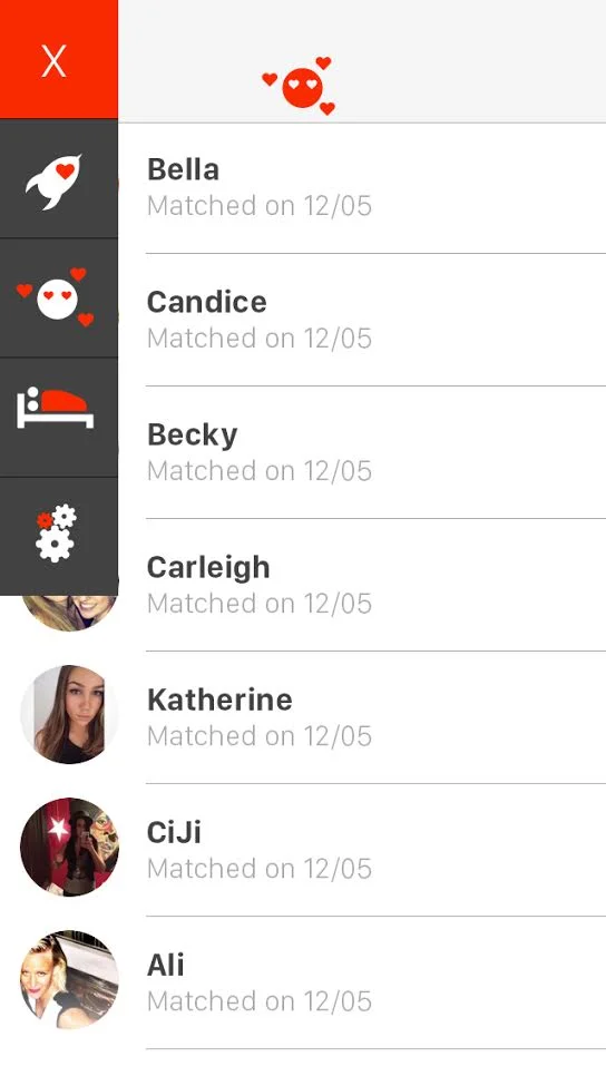
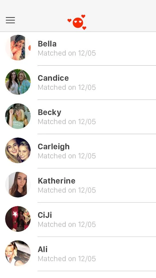
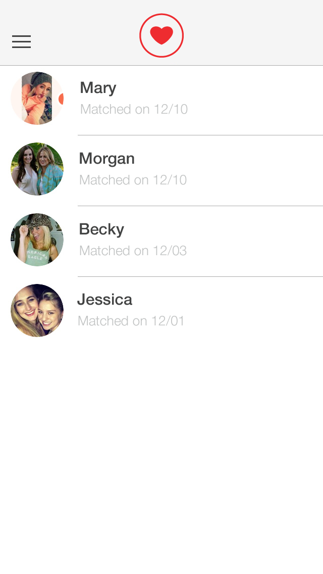
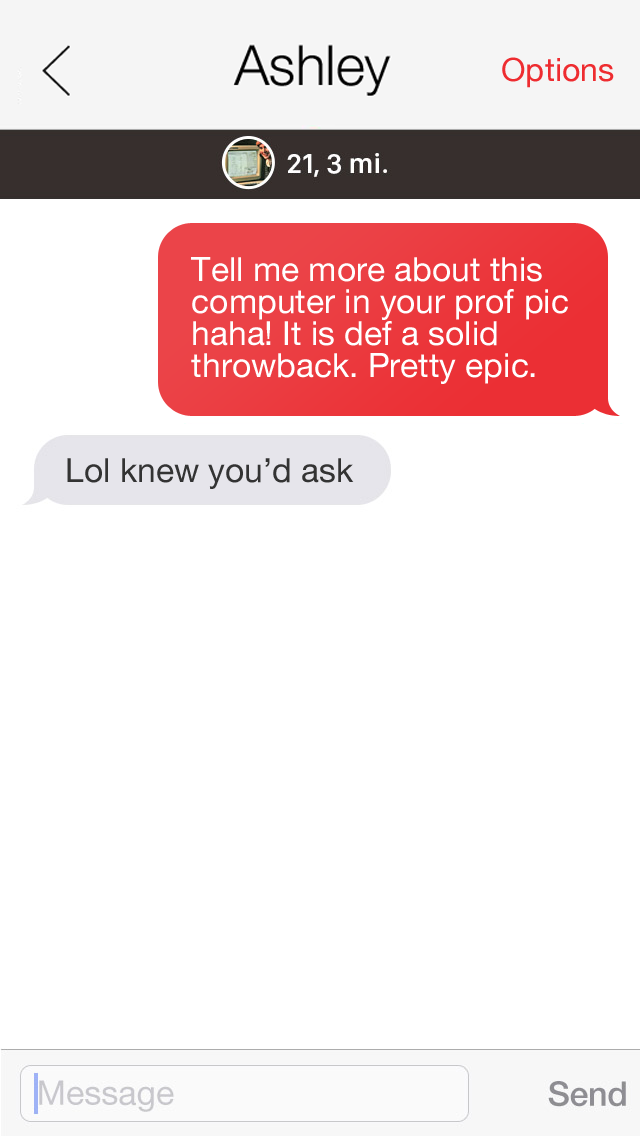
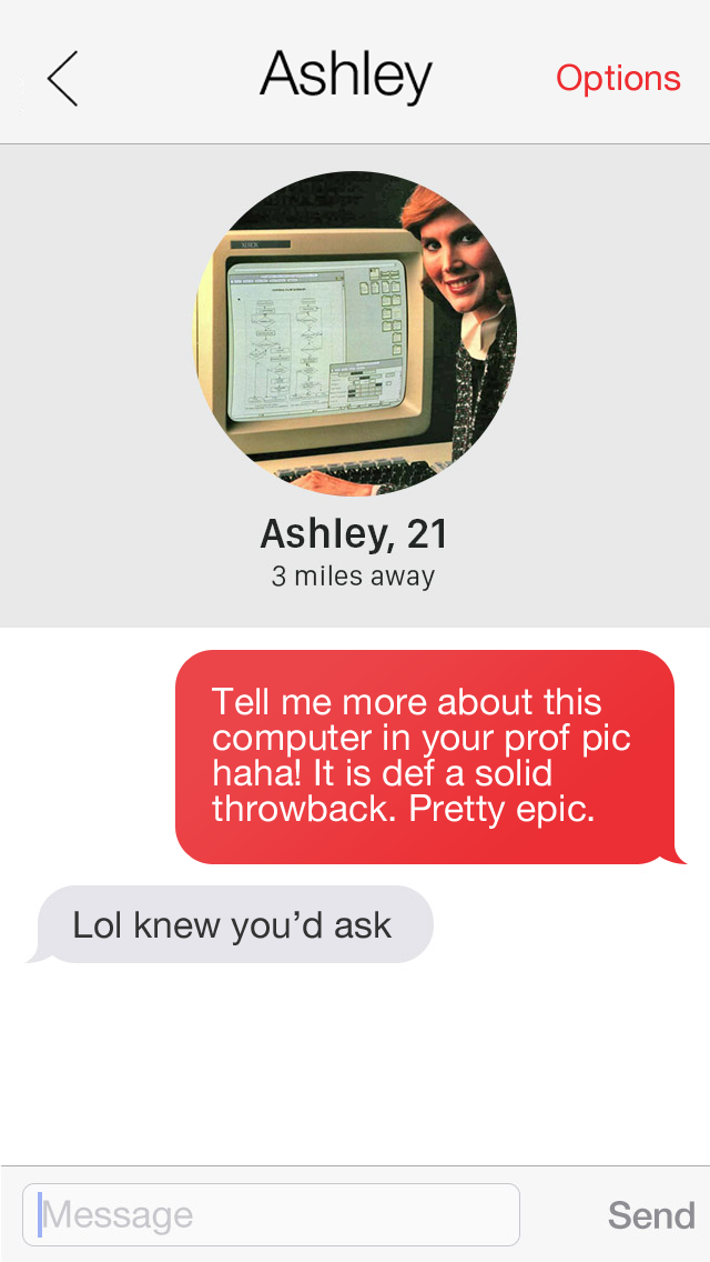
Here is a quick overview of the minor tweaks I made to the existing designs to better tie the interface together. The Had team felt good about the more cohesive feel of the application and went on to get some design feedback from external testers while I dug into tackling the "Game" view of the app.
Adjustments made:
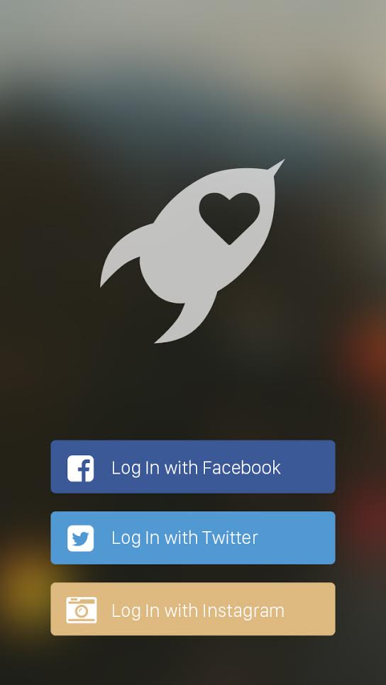
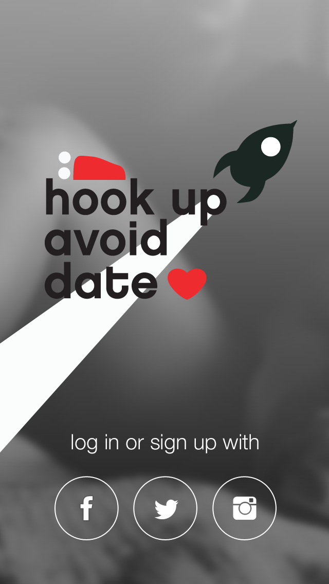
• Login/Signup modification with new branding and icons
• Changed hue of red
• Refined iconography for simpler and more cohesive marks
• Carried "red" throughout the app where applicable
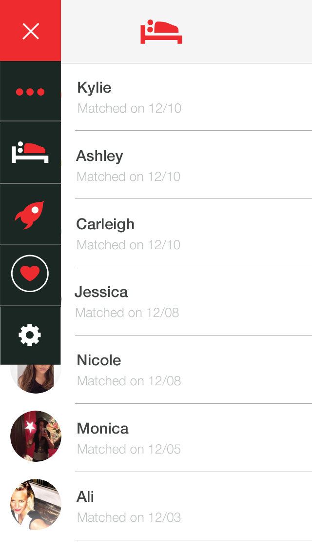
• Addition of icon in menu for "Game" view
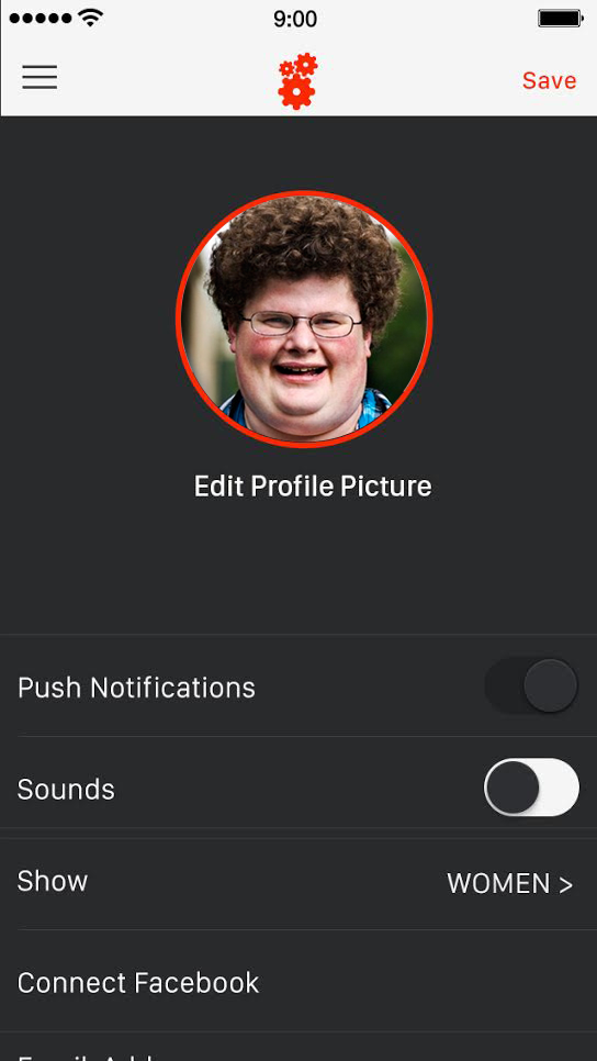
• Refinements and functional specs for user Profile Settings
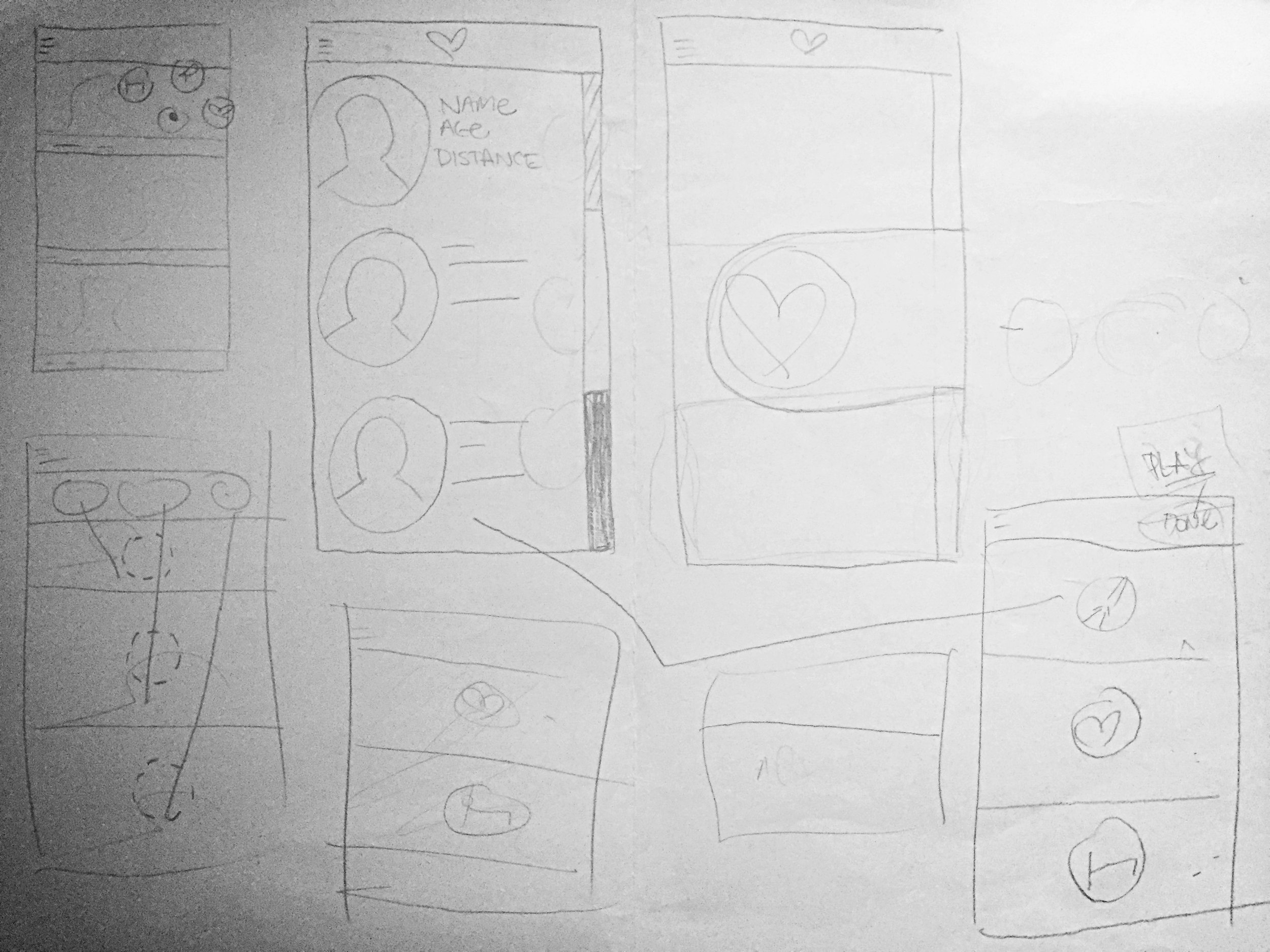
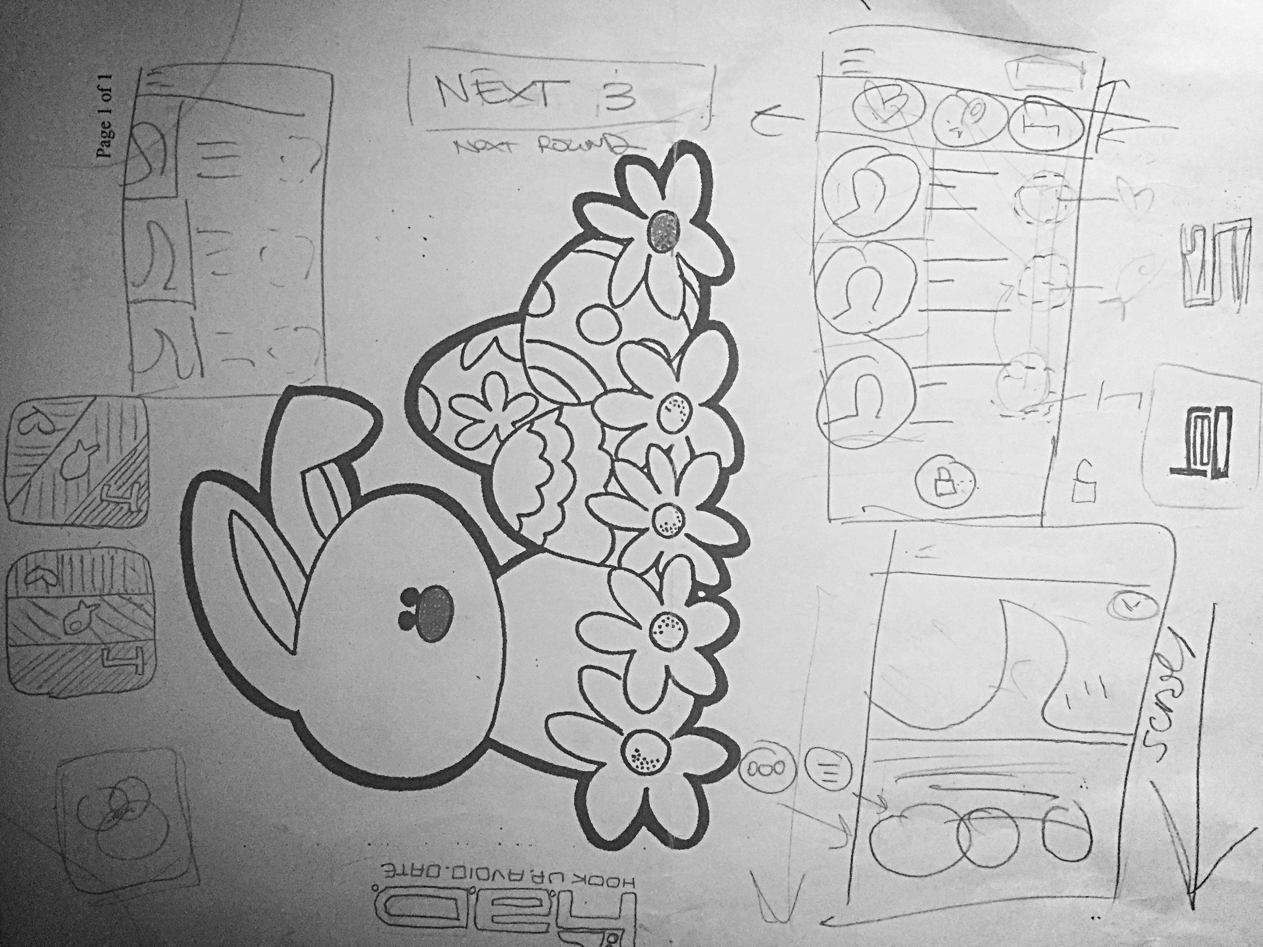
Several ideas...Rapid fire sketching.
I started by thinking about other apps tasked with developing a killer UI/UX solution for "multiple selections" within a view. It also was important to keep in mind the multiple ways users could pick their "intentions" – from the main Game view and also from a user's profile view.
.We were moving rather quickly in order to hit a deadline for the beta launch party at ASU.
When the idea for the final view came together, I happened to be out at dinner with one of the Had team members.... So it was either a napkin or Easter kids menu for sketch paper!
More than just a swipe L or swipe R scenario
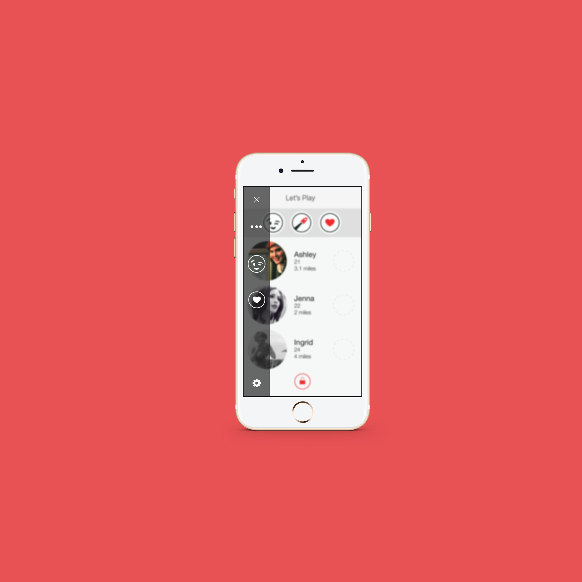
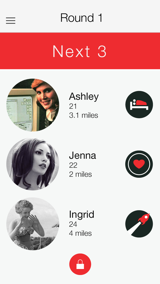
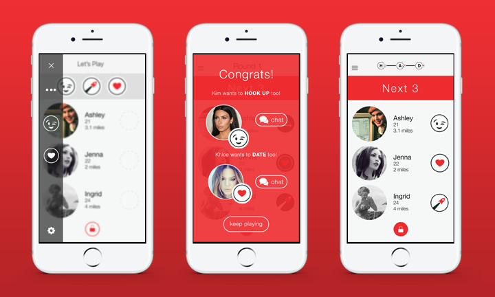
As I began to dive deeper into the Game view. I decided it was important to chat with people about their experience playing the game that was the impetus for this app. After having simple conversations about people's experience with "Marry F*** Kill", I quickly realized that a main user story developed...people changed their minds a lot while they were forced to make their 3 selections. That being said, it was important for a Had user to be able to "move around" their selections so to speak before locking them in and proceeding to the next round. The team was very happy with the final drag and drop Game view shown below.
Party time! – and by party time I obviously mean testing time!
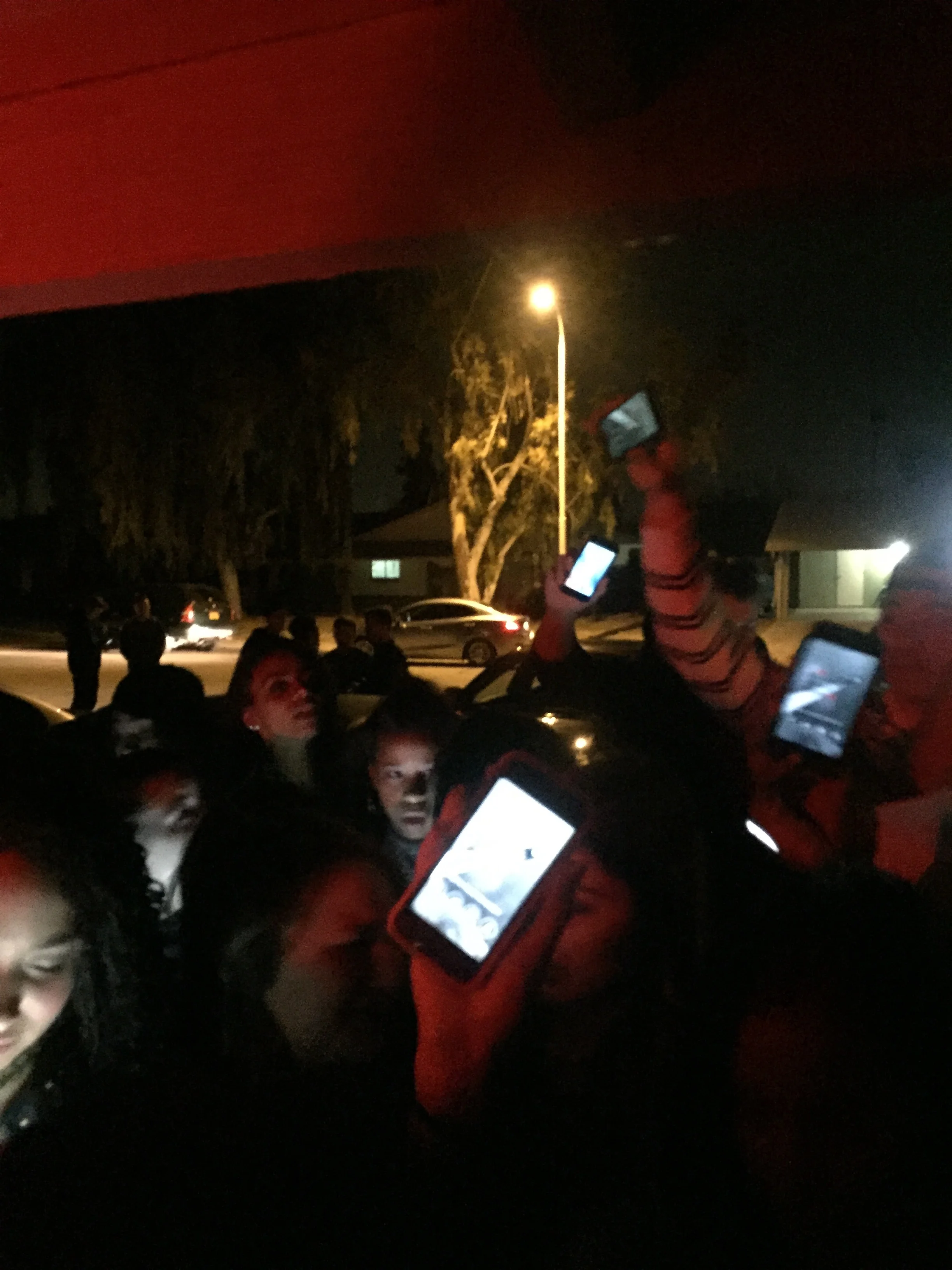
The Had team put together a spectacular launch party at Arizona State University. Entry to the party was contingent on showing your Had user profile at the door! With over 3,000 in a weekend, we set out to learn more from the analytics and comments that were shared on social media.
Anxious party-goers flashing the Had app at the door!
The aftermath...
Honesty doesn't always have to be so harsh.
While the users loved that the app required you to set your intentions from the very beginning; the female users brought up some concerns. After seeing some repetitive remarks regarding the dark coloring throughout the app, as well as the aggressive bed (hookup) icon. We decided to survey some testers we had built relationships with to get more insight and ideas for solutions.
"I like the honesty of letting guys know
what I am looking for, but I felt a bit
too promiscuous and embarrassed
choosing the Bed icon."
– Rachel, Had beta tester
Reevaluate. Reiterate. Repeat.
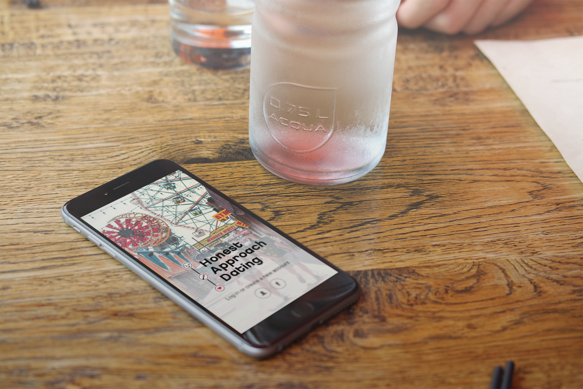
Taking user feedback to heart, we went back to the drawing board and even reevaluated the name of the App itself. Keeping the same acronym "Had" the founders decided on "Honest Approach Dating" to soften the brand and appeal to a wider audience. We lightened the overall UI by swapping all dark assets, with new lighter versions. After interviews and user suggestions, the "wink" icon was substituted for the "bed." A/B testing showed a significant increase in "hook up" selections when using the "wink" versus the "bed." We listened, made the changes and are excited that more users are feeling a little more confident and flirty using Had.
With the bulk of the UI/UX work done for now, the team has pivoted their focus to designing and implementing marketing initiatives to boost the Had dating pool.
Single? Appreciate honesty? The Had app is available for download on the iOS App Store.

