
HealthQik
Simplifiying the healthcare system in India, by streamlining the connection between doctors, clinics, patients and more.
"Simplifying healthcare in India" – now thats a big mission. Where do we start?
HealthQik planned to make health care more accessible to patients and more manageable for all healthcare providers any time, anywhere by connecting patients with doctors, helping organize charts, and keep track of prescriptions. I came on board as a contract designer to help with naming, branding, and UI/UX design. The founders were interested in my help to get a start on deliverables that would help them secure funding and aid in future development. My main product objectives were to design a simple and informational landing/homepage, the on boarding for 4+ different user types, and help develop a process, flows, and wireframes to set the tone for later down the line.
PROJECT OVERVIEW
Company: HealthQik
Date: 2016
Role: UX Designer
Disciplines: Product Strategy, UX Design, Branding
Determining and understanding the different users and their needs.
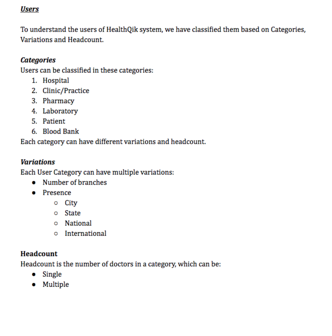
First, it was important for me to chat with the founder (who was from India) about the current healthcare system in India so I could better understand the pain points and where patients and doctors experience friction. After I had a good understanding, we started by breaking the team's ideas for the system down into separate modules and determining what that flow would entail for each different type of user. From there, we narrowed it down even further to include the 4 user groups that were most unique.
• Hospital
• Clinic/Practice
• Doctor
• Patient
Informational, educational, helpful
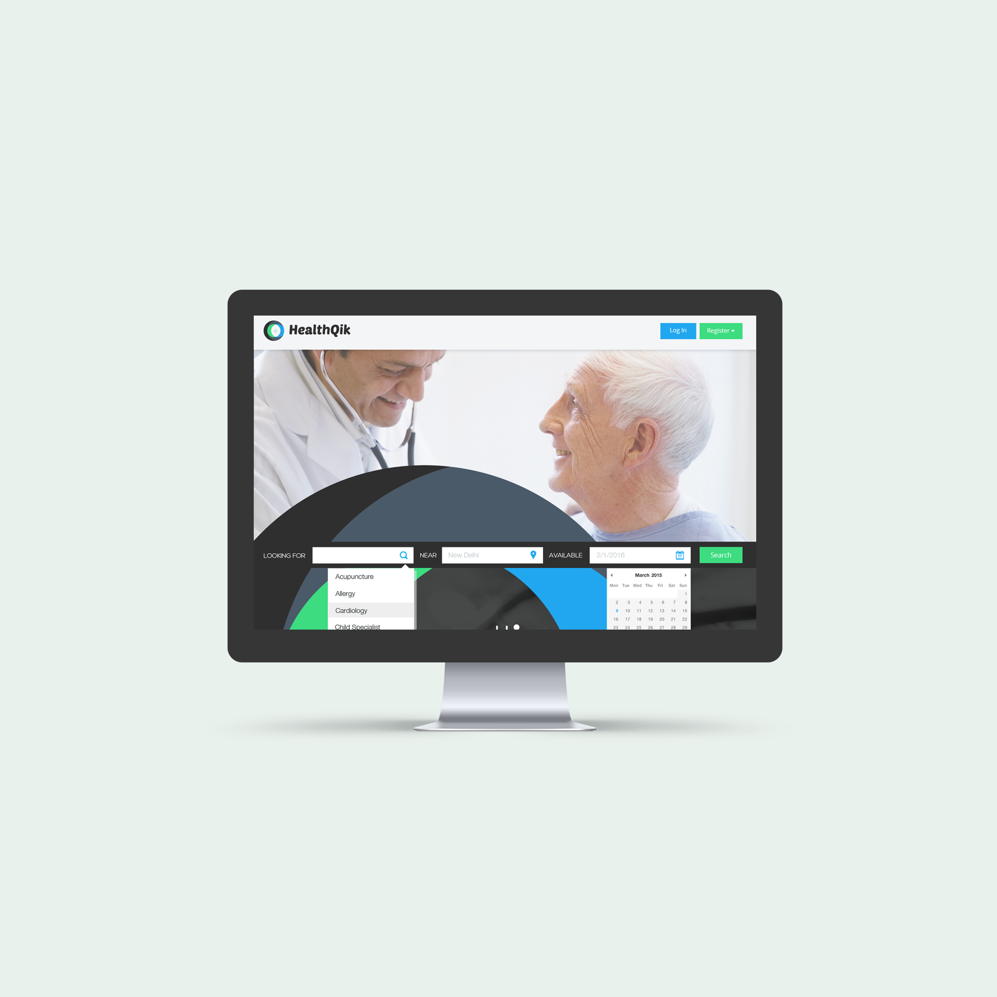
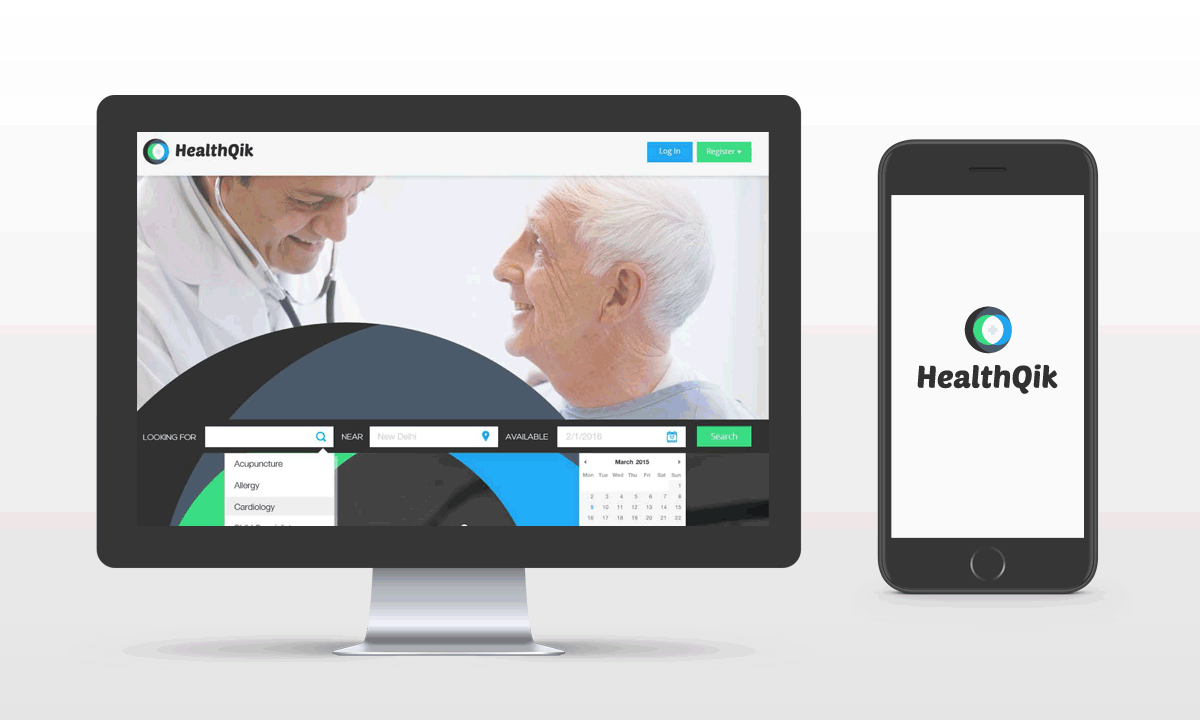
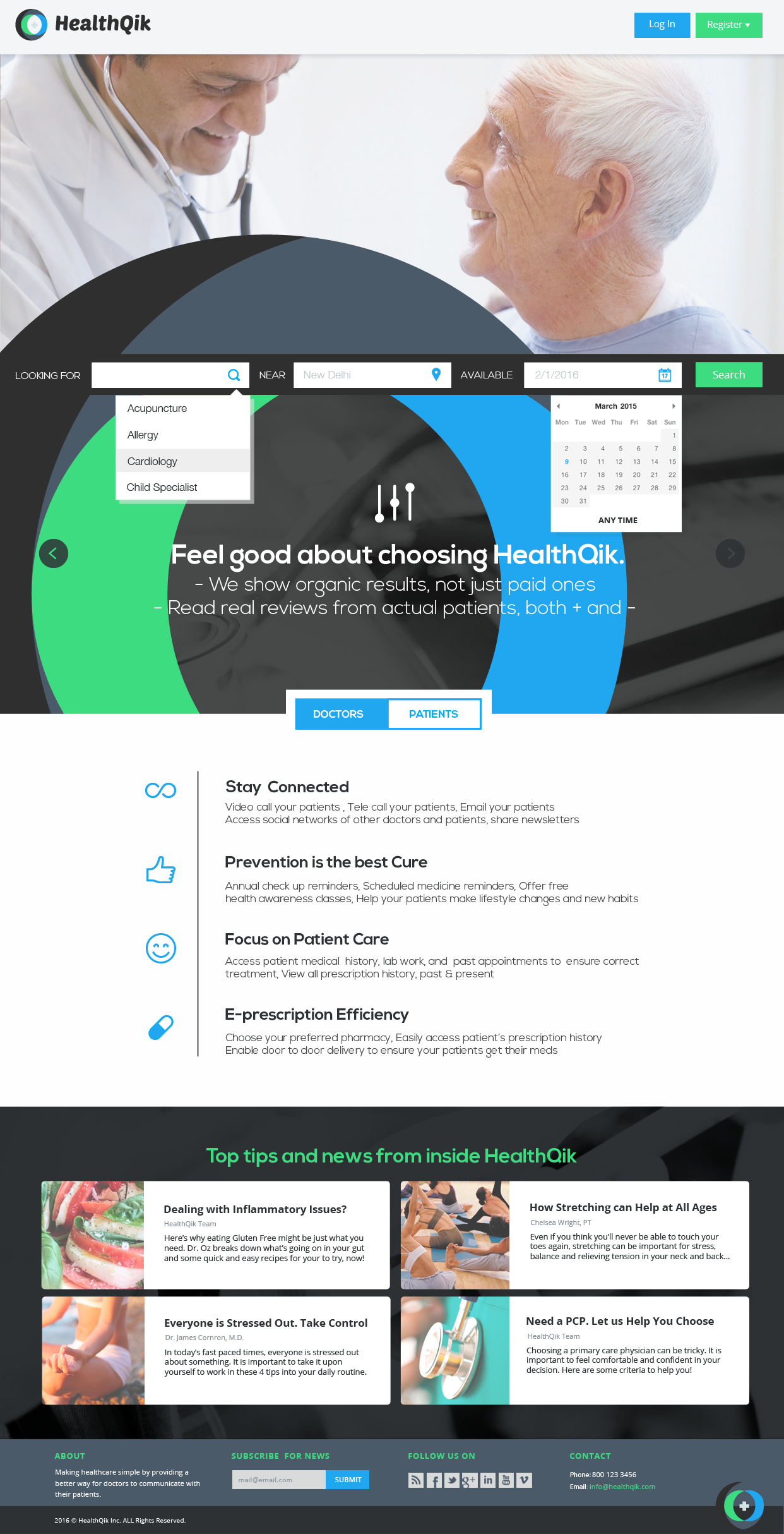
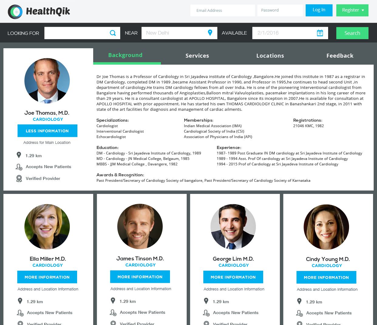
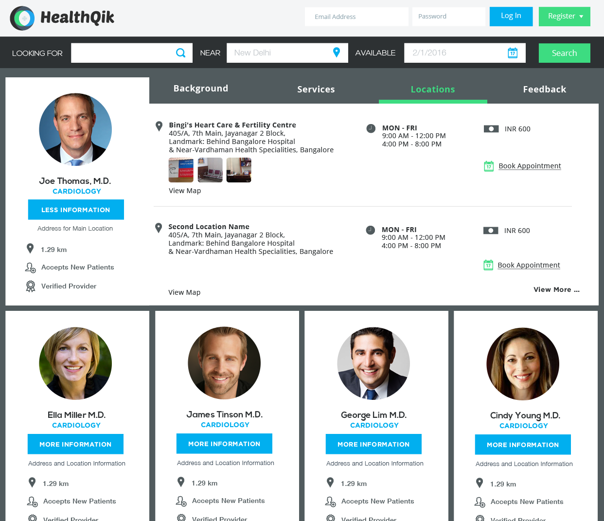
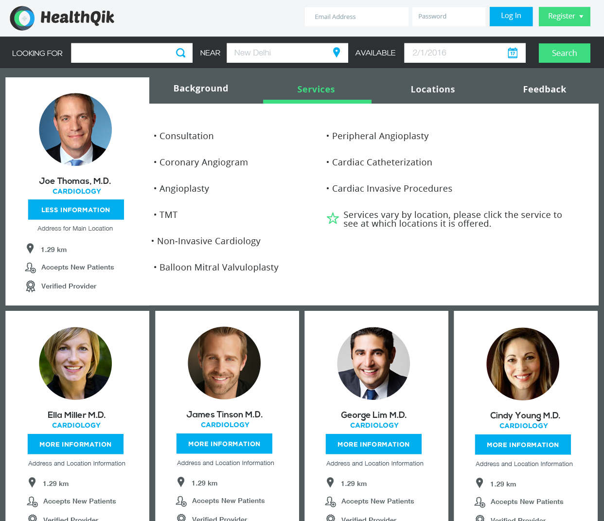
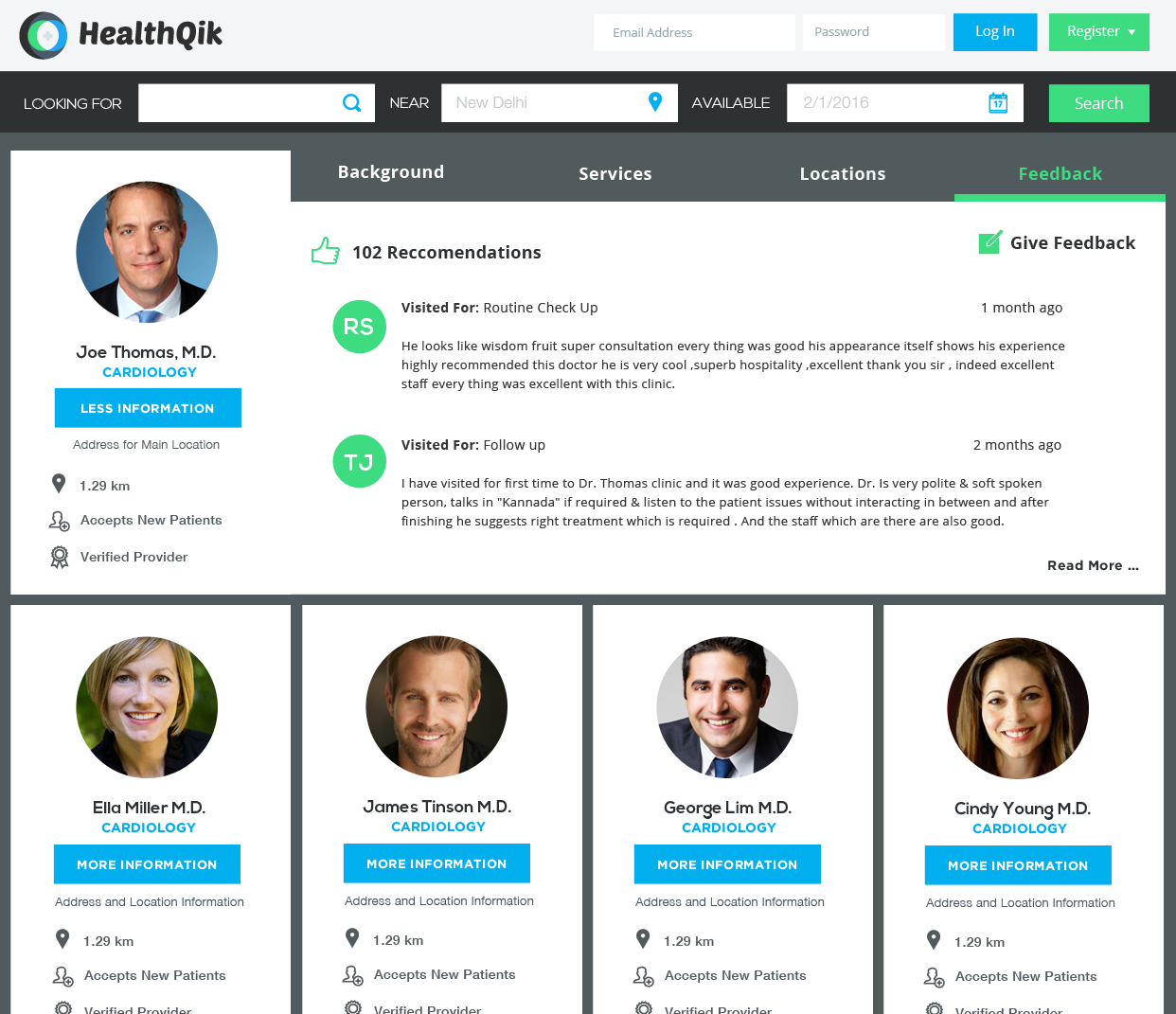
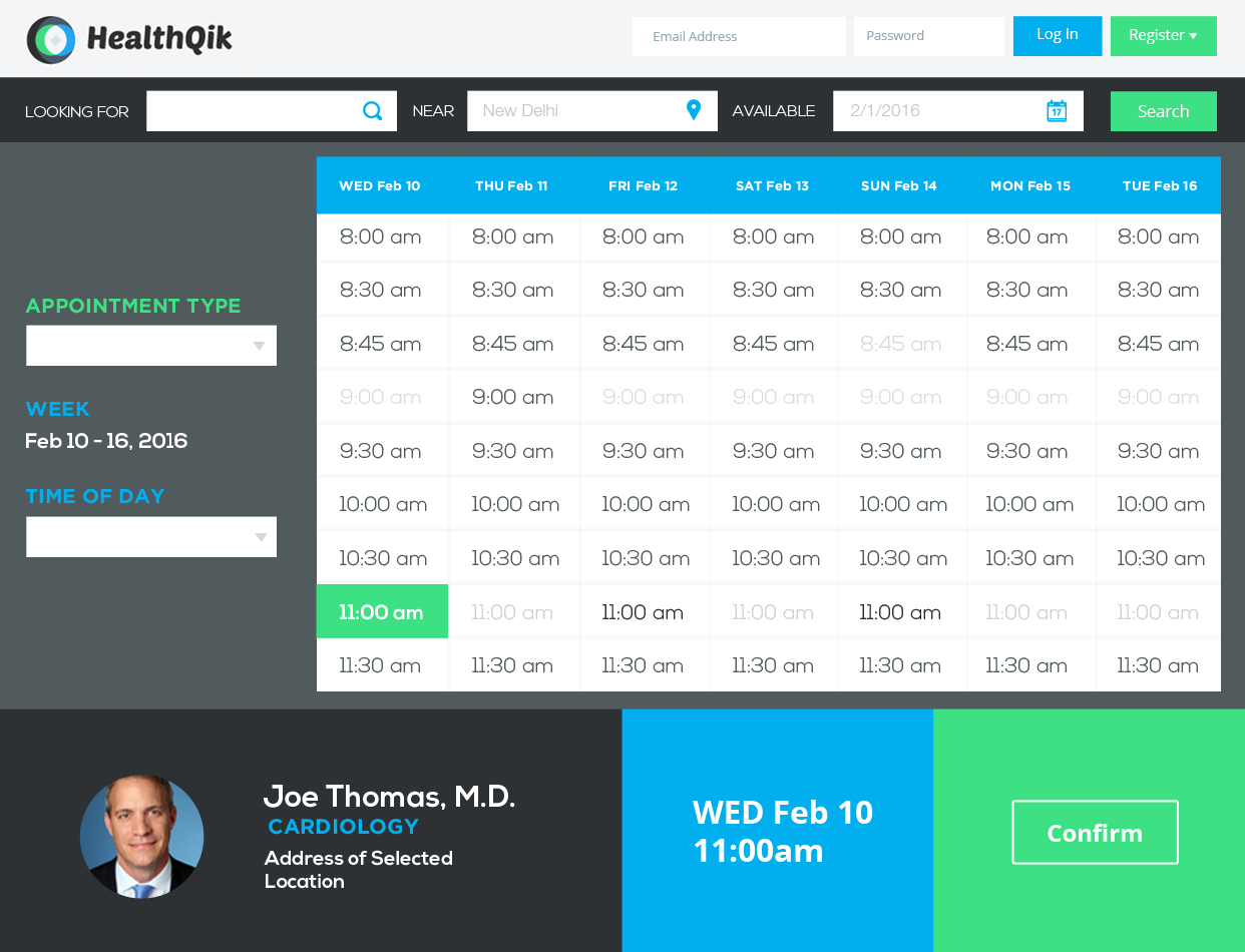
The client's objectives for the homepage changed frequently, but we ended up placing heavy focus on Patients and Doctors and their conversion to registered HealthQik members. We wanted the homepage to feel inviting for both user types, and give them a taste of what they could have access to by becoming a member. A non-registered user could learn more about benefits, browse informational articles on healthy habits, and could even begin the process of booking an appointment by searching for a doctor (by name, location, or ailment/specialty). Below is an example of one iteration of the system.
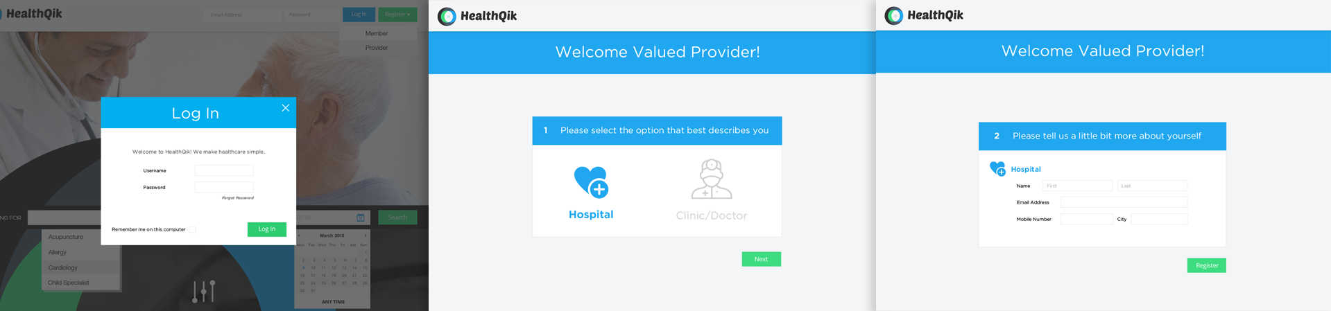
Tackling the sign-up flow
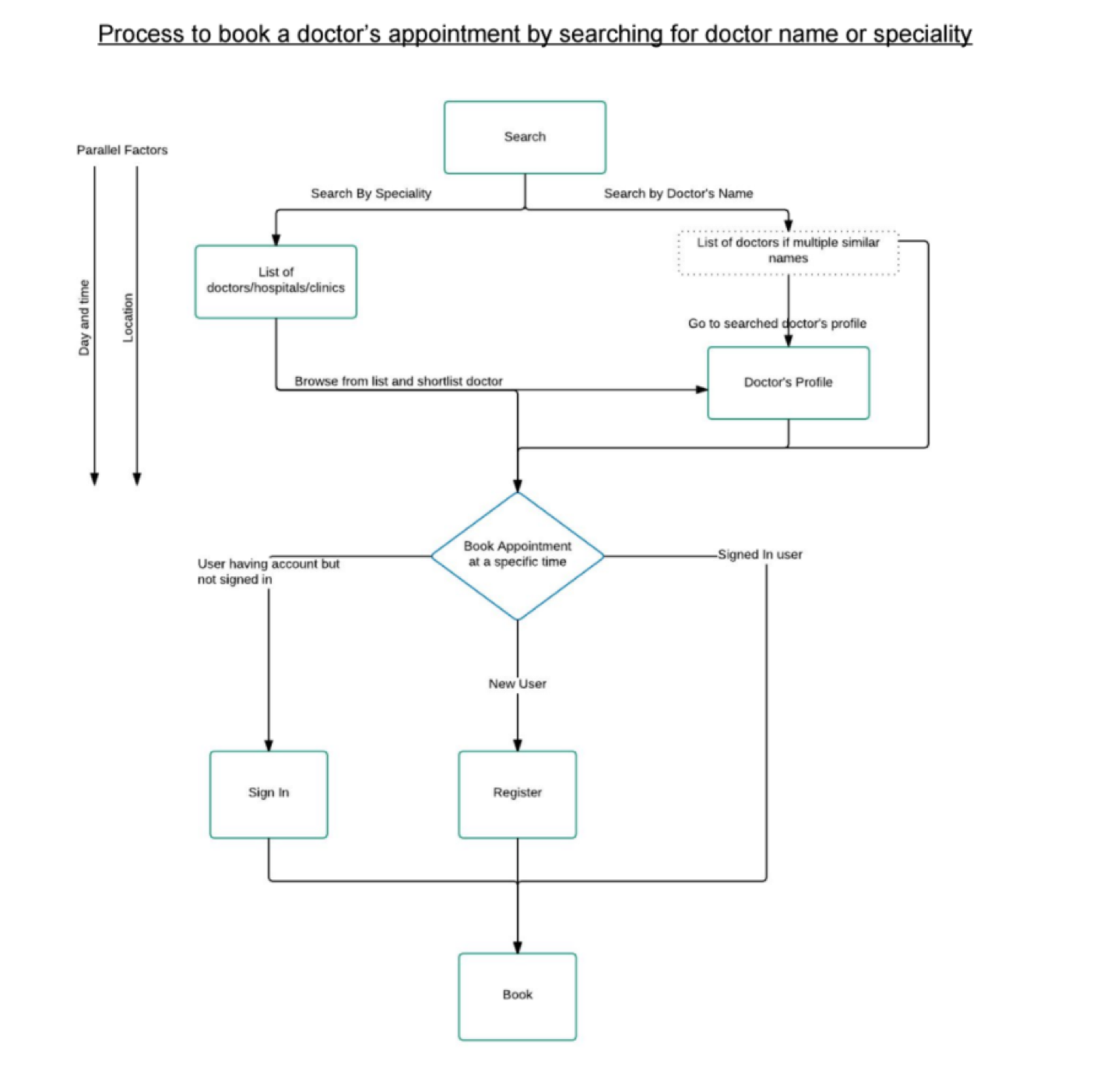
This is an example of the flow we used for the appointment booking sequence. On boarding flows were presented similarly.
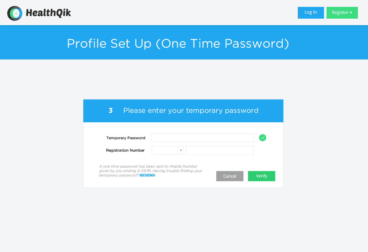
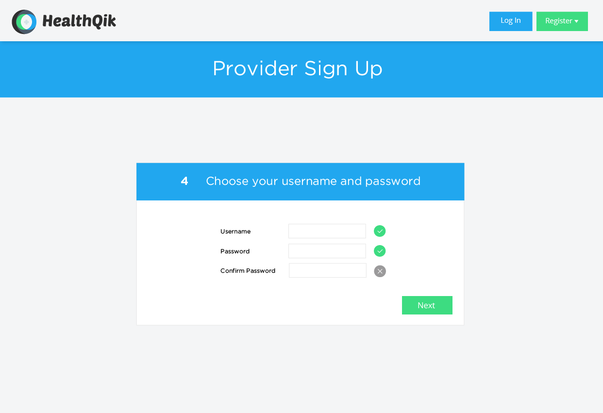
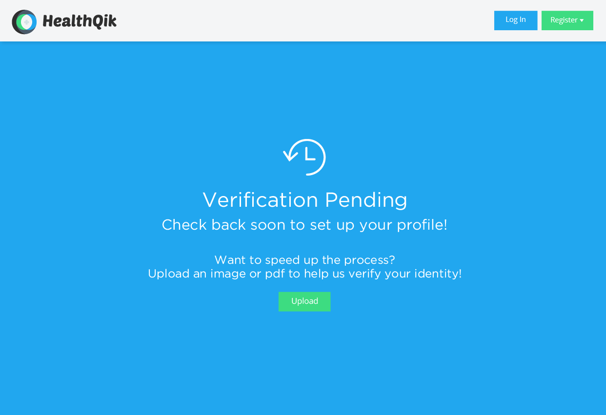
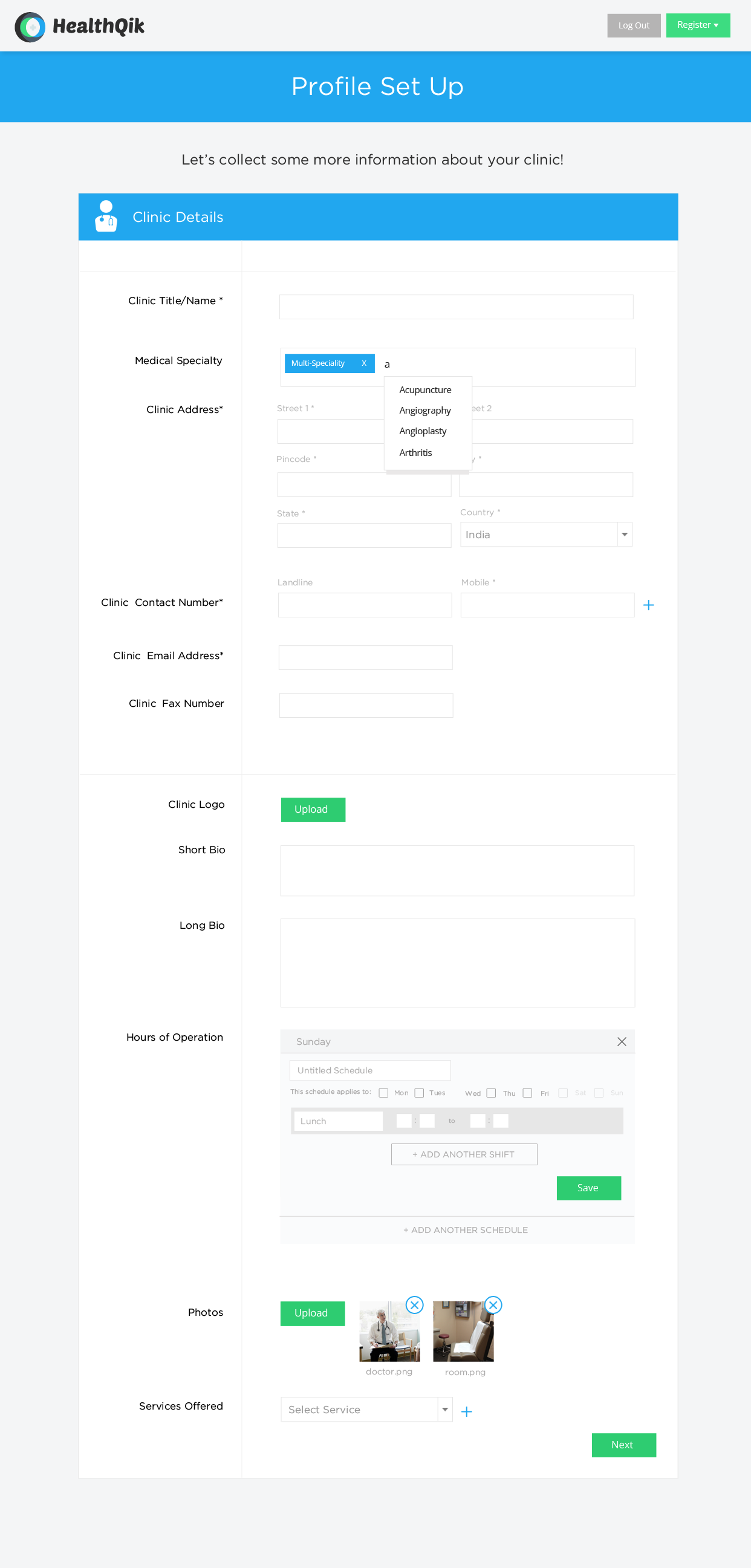
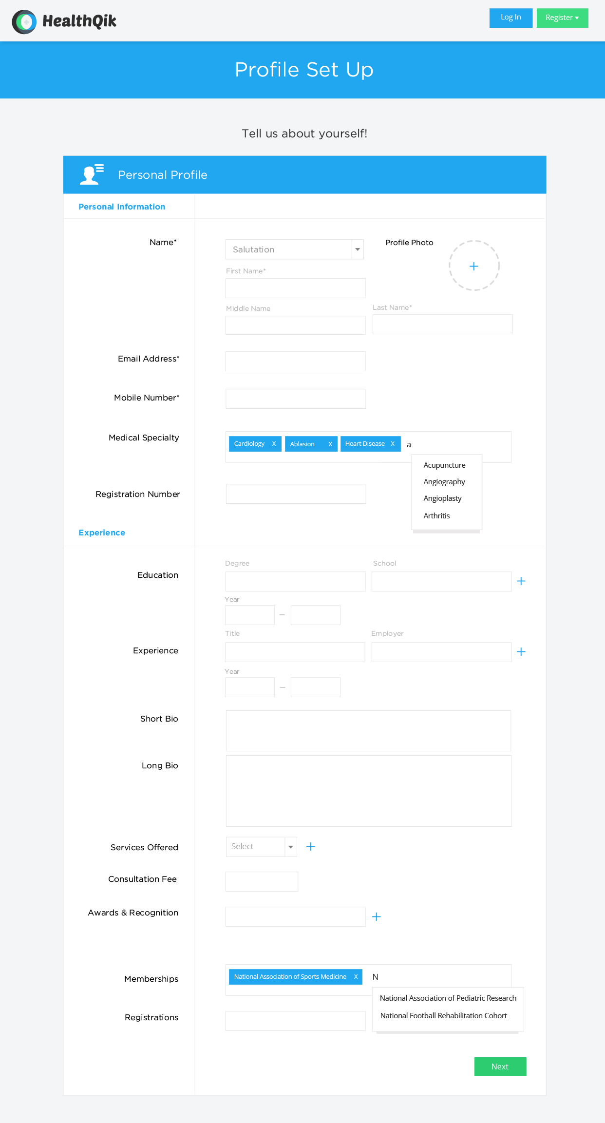
This portion of the project was a critical step and one that required a closer look into competitive systems. Designing for the medical field requires an attention to privacy and equal emphasis on professional credentials. I worked alongside a wonderful UX Researcher to get a better understanding of what works and what doesn't in current systems. Following our research, she created user flows and I started parsing through the information we were required to collect and determining which was crucial for initial signup, and what could wait.
We wanted to make the on boarding as simple as possible for the older demographic of doctors; but also as robust as possible for a "power user" that might want to add awards, specialties, memberships and registrations.
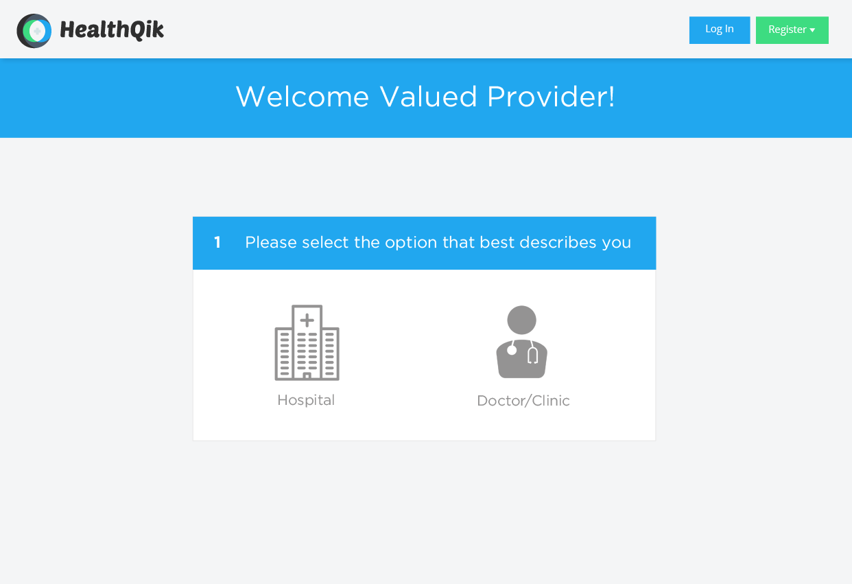
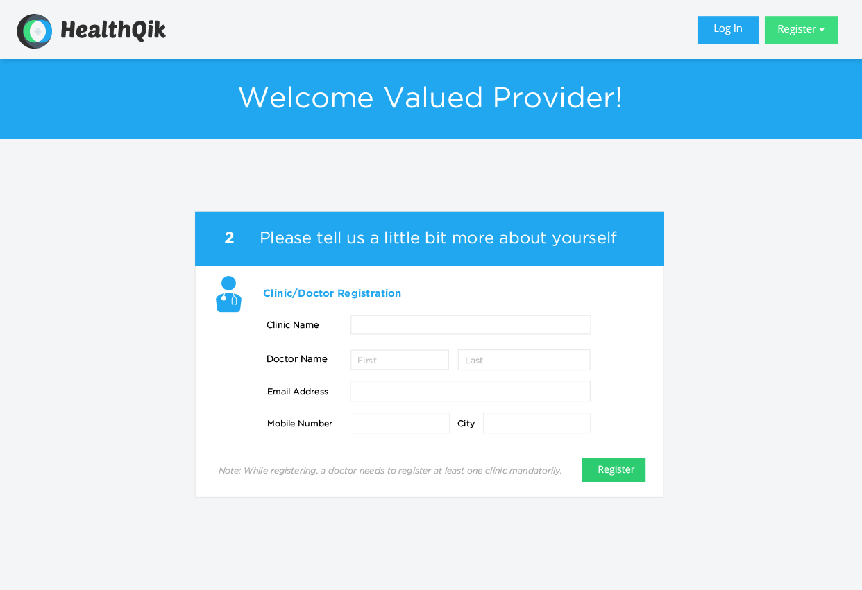
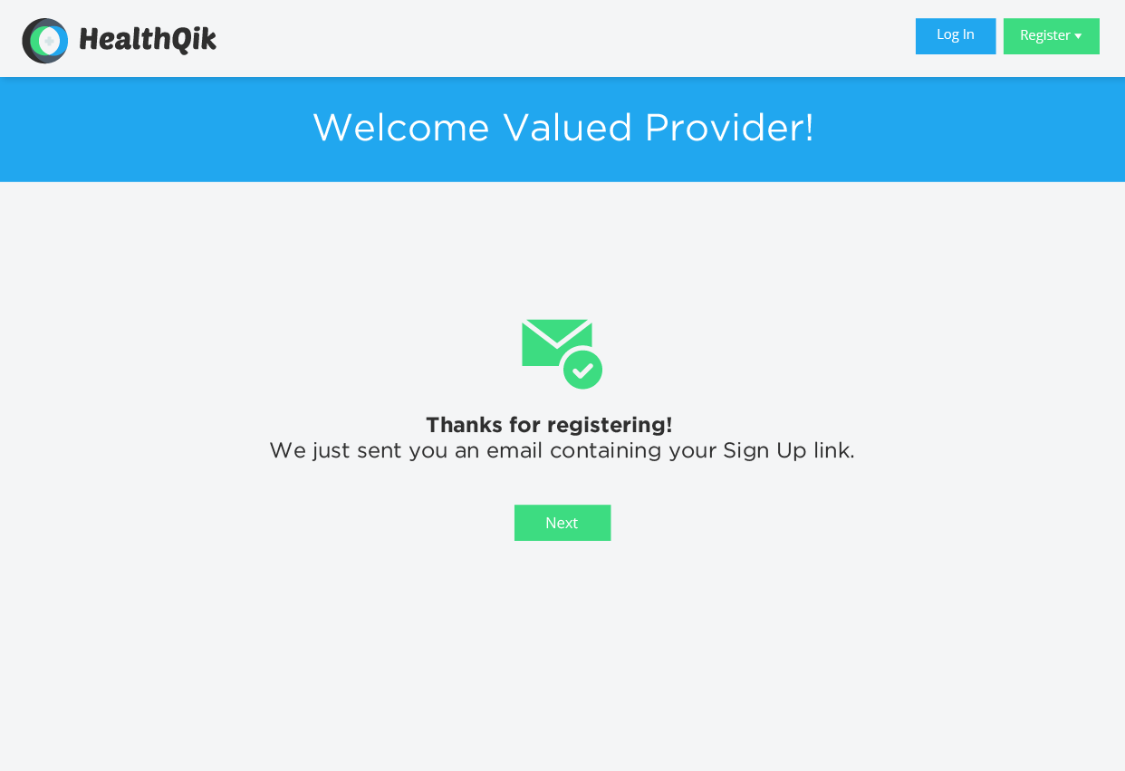
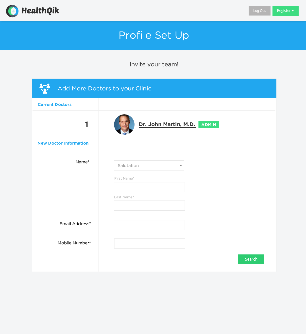
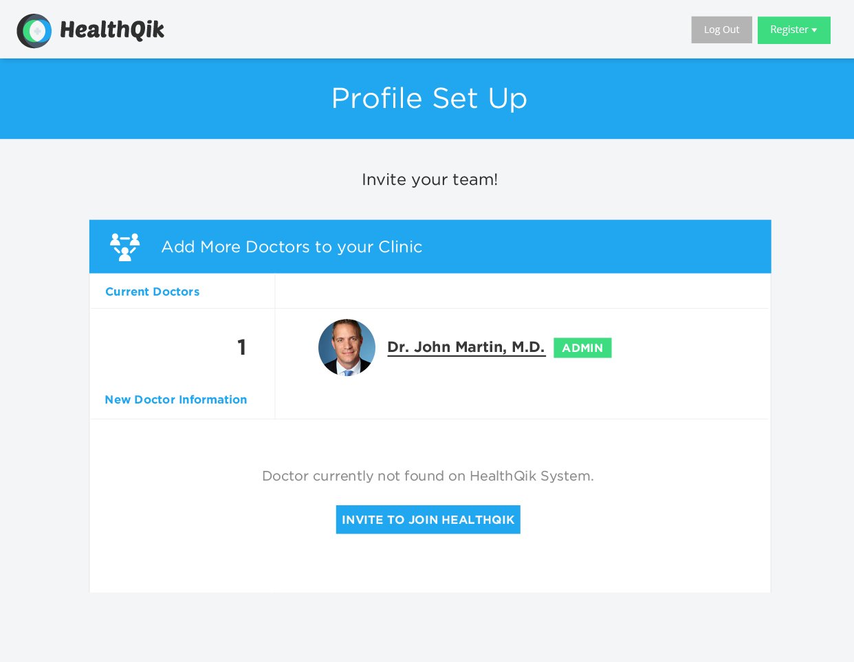
Doctors, Clinics, Hospitals oh my!
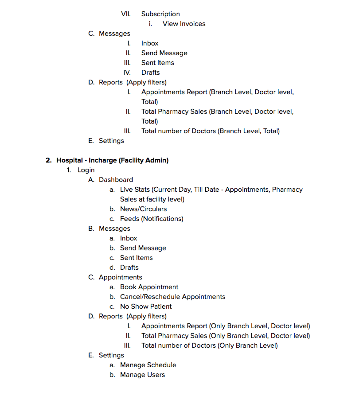
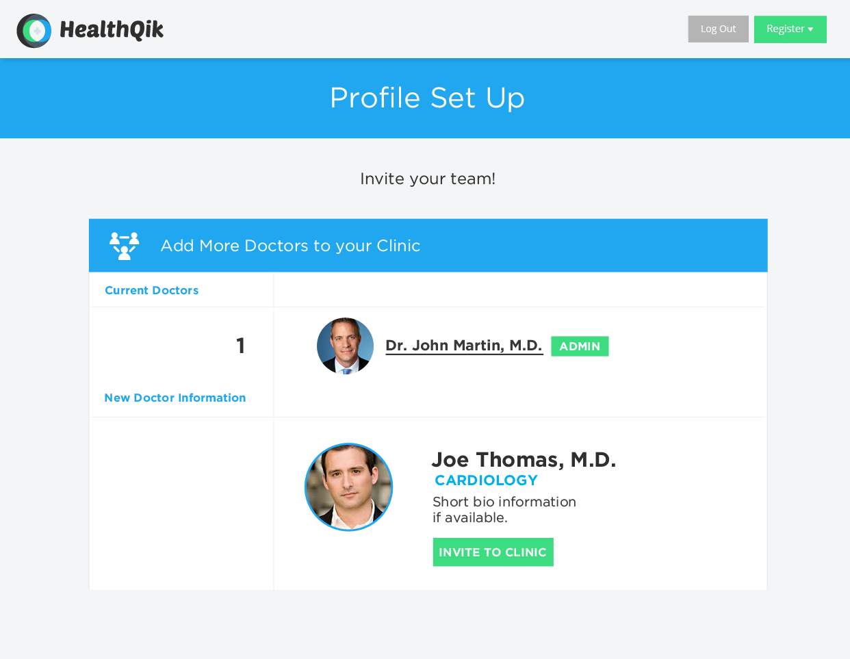
Naturally, the on boarding for a doctor was more complex than that of a patient. It was critical to think about the idiosyncrasies of the systems that doctors operate within and others that play a role in their practice. For example, if a hospital joins HealthQik the account may be created by an administrator that is only a piece of the larger establishment. Or a doctor might run his or her own individual clinic and want to invite their team of partners to join the clinic's HealthQik page. We went through various iterations of this flow, testing with doctors and medical professionals to tweak requirements along the way. Implementing a step by step approach allowed for a more digestible experience for the user, and a more manageable system for the HealthQik engineering team.
Final steps and the setup for success!
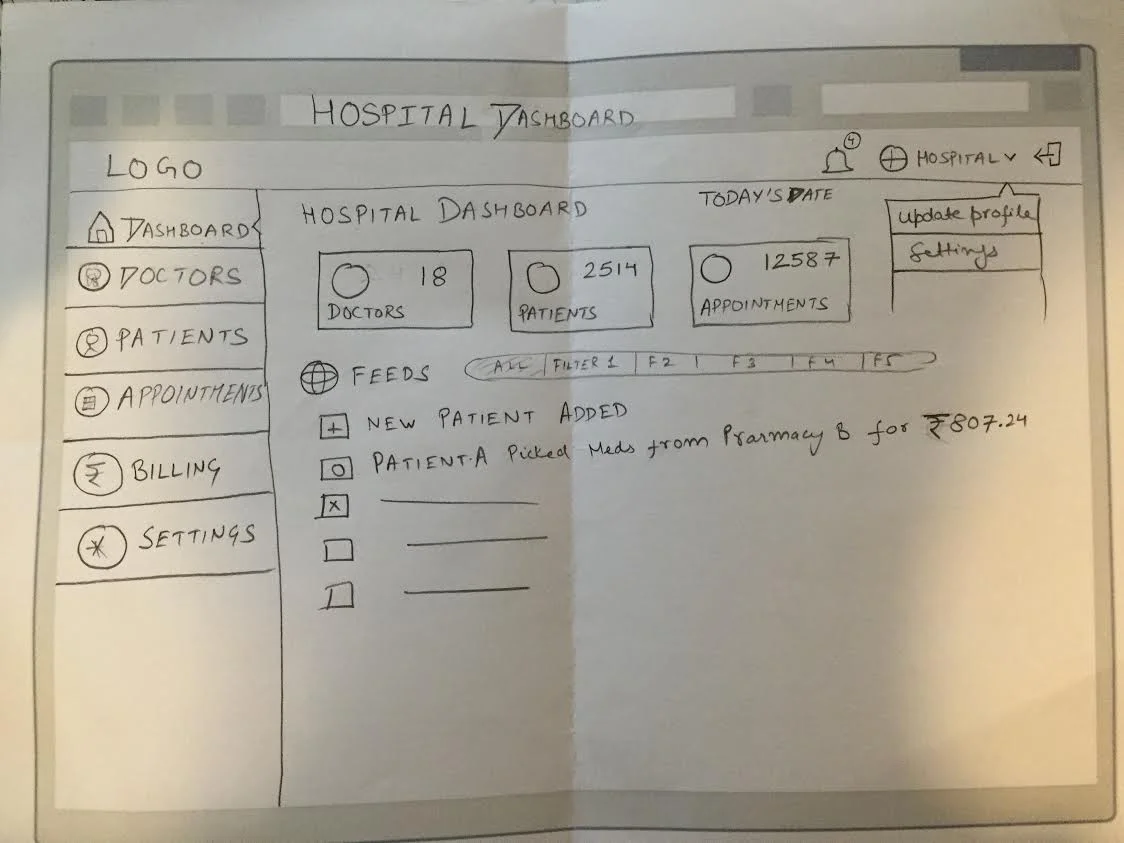
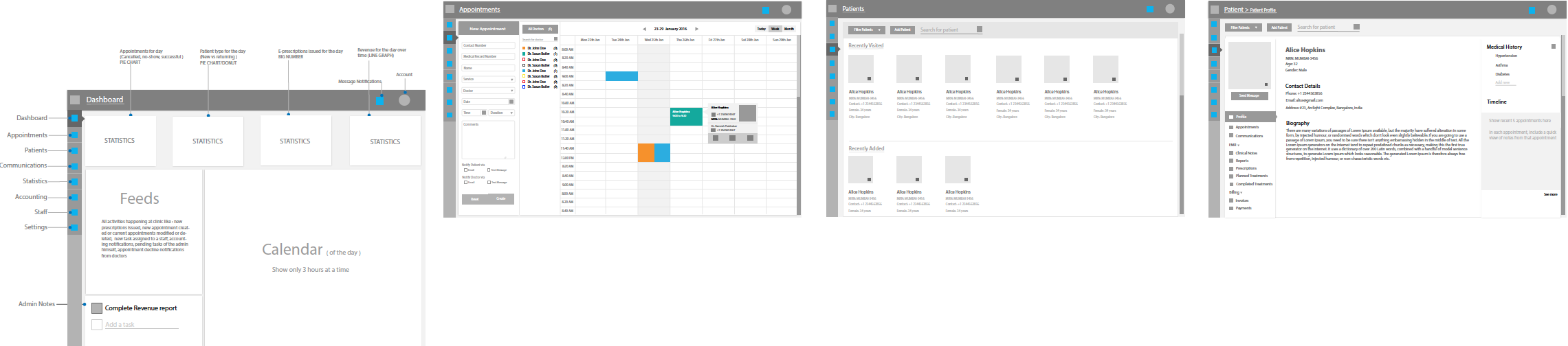
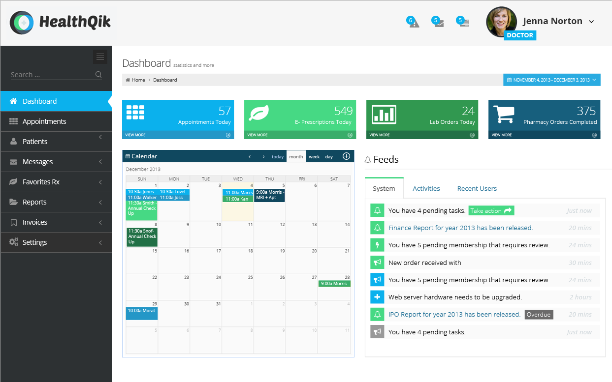
Although outside the initial scope of the project and materials needed for funding; the HealthQik founder was keen on the idea of a "doctor dashboard." Working with the UX Researcher/Designer; I helped develop rough wireframes for the dashboard and I put together a visual mockup to get the ball rolling and help the team be prepared for what was coming next!
Establishing a process was insanely important throughout this project. Helping the teammates on a project understand and implement a process oriented way of thinking can be a true differentiator when it comes to the end deliverable.
“We loved the professionalism you showed
in documenting everything you do. That will
be very useful for us in showing the
workflow to potential funders.”
– Abhinav, HealthQik Founder